Last year the <dialog> element was added to the HTML spec. It allows you to create a dialog that is native to the browser. This means that it will provide some out of the box usability options. This is great news for accessibility and usability. But to use those feature we need ot take advantage of the native API.
A Simple Component
A simple component can be made like so:
import React, { useRef, useEffect } from 'react';

export default function Dialog({ children, open }) {
  const dialogRef = useRef(null);

  useEffect(() => {
    if (dialogRef.current) {
      if (open) {
        dialogRef.current.showModal();
      } else {
        dialogRef.current.close();
      }
    }
  }, [open]);

  return (
    <dialog ref={dialogRef}>
      {children}
    </dialog>
  );
}
And since dialogs dont inherit styles from the body like backgrounds and colors, we need to add some styles:
dialog {
  background-color: $color-bg;
  color: $color-text;
  font-family: $font-sans;

  &::backdrop {
    background-color: rgba($color-bg, 0.6);
  }
}
And used like a regular component:
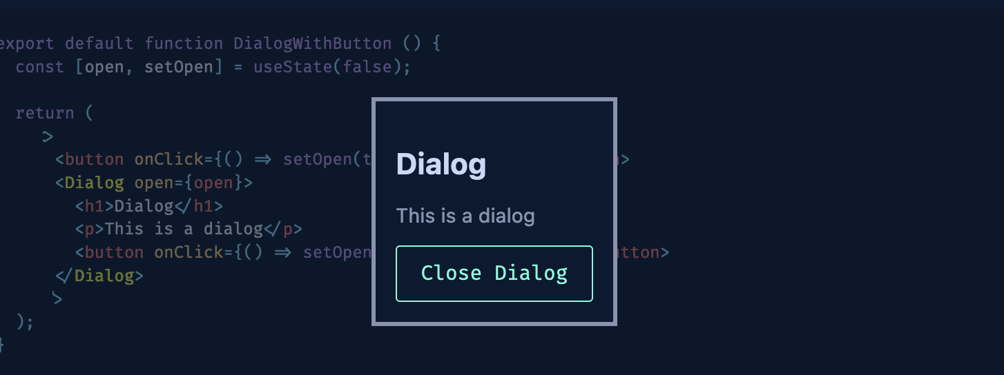
export default function DialogWithButton () {
  const [open, setOpen] = useState(false);

  return (
    <>
      <button onClick={() => setOpen(true)}>Open Dialog</button>
      <Dialog open={open}>
        <h1>Dialog</h1>
        <p>This is a dialog</p>
        <button onClick={() => setOpen(false)}>Close Dialog</button>
      </Dialog>
    </>
  );
}
Try it out:
Adding functionallity
The dialog functionality already allows us to prevent interacting with the rest of the page while the dialog is open. But most modal libraries you build or use will have some sort of functionallity to close the modal (onClickOutside) when you click outside of it. So lets add that:
import React, { useRef, useEffect } from 'react';

function Dialog ({ children, open, onClose }) {
  const dialogRef = useRef(null);

  useEffect(() => {
    let justOpened = false;
    if (dialogRef.current) {
      if (open) {
        dialogRef.current.showModal();
        justOpened = true;
      } else {
        dialogRef.current.close();
      }
    }

    const onClick = (e: MouseEvent) => {
      // dont close on initial open/click
      if (!open || !dialogRef.current || justOpened) {
        justOpened = false;
        return;
      }

      // Bounding box as checking target wont work
      // if the dialog has padding (default browser behavior)
      var rect = dialogRef.current.getBoundingClientRect();
      var isInDialog =
        rect.top <= e.clientY &&
        e.clientY <= rect.top + rect.height &&
        rect.left <= e.clientX &&
        e.clientX <= rect.left + rect.width;

      if (!isInDialog) {
        onClose();
      }
    };

    if(open){
      document.addEventListener('click', onClick);
    }else{
      document.removeEventListener('click', onClick);
    }

    return () => {
      document.removeEventListener('click', onClick);
    };
  }, [open]);

  return (
    <dialog ref={dialogRef}>
      {children}
    </dialog>
  );
}
Notice that we added in a little bit of logic to prevent the dialog from closing when it is first opened. But it will still close now if you click the backdrop.
From here you can add all the usual positioning and styling you would expect from a modal including titls, buttons and other items. And you get to save a lot of effort implementing the accessibility and usability features that come with the native dialog; as well as the performance benefits of using native elements instead of your own overlays and divs for positioning.
A Note on Popovers
The Popover API is coming soon (still not supported by all browsers) and will add even more functionallity to things like the above dialog but without the blocking backdrop (optionally).
I look forward to popovers becoming standard as well as it will allow you to replace things like tooltips and toasts with native elements.